On the move in Columbus
Things to do and ways to get there


Get a ride when you need one
Sign up to rideStart earning in your city
Sign up to driveGet a ride when you need one
Download the AppStart earning in your city
Sign up to drive

Engineering, Backend, Data / ML
How LedgerStore Supports Trillions of Indexes at Uber
April 4 / Global

Most popular
Delivery promotions, DeliverMarch 25 / US
The Easter Shop and Pay with Uber Eats Gift Card Sweepstakes Official Rules

ProductsMarch 25 / US
UberX Priority FAQ

HealthMarch 28 / US
Uber Health and Findhelp support patients beyond the four walls of a medical office
Engineering, AI, Data / MLMarch 28 / Global
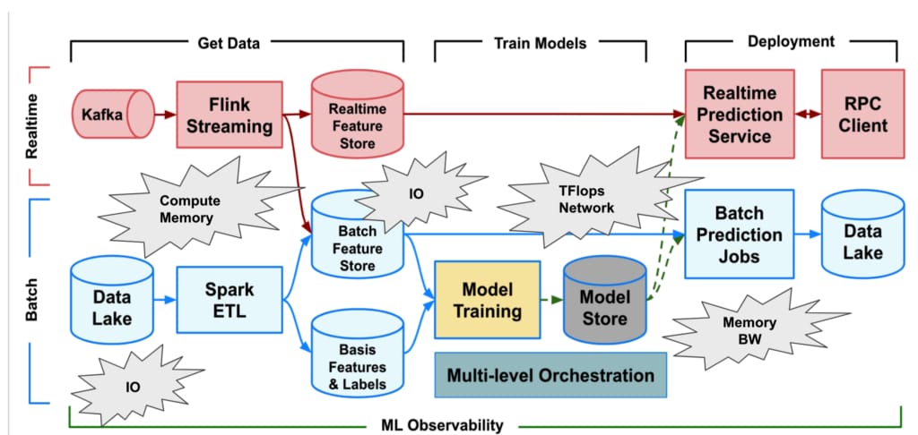
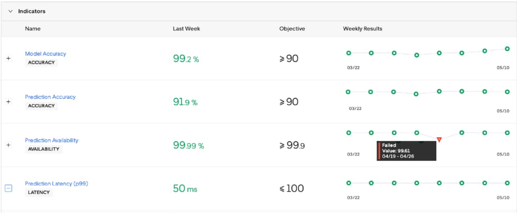
Scaling AI/ML Infrastructure at Uber


Products
Company
